One of my constant irritations, as someone who loves to run and loves to analyze data, is that despite the many wonderful apps and gadgets we have for taking detailed measurements of our exercise patterns, the analyses that get shown to us as end-users of this tech are… well, at best they are boring. We get shown some graphs counting the number of steps we’ve taken, or a map showing where we ran on a specific day, and that’s about as good as it gets. Sadly, these anodyne data visualisations are often mixed with analyses that make absolutely no statistical sense, and a whole lot of junk that is best characterised as noise.1 Fortunately, it’s usually possible to export your data from these platforms and then do whatever analyses you want.2
To that end, I decided the time has come to download my runkeeper data and use it to draw some maps I actually want to see, and to answer some questions that have been nagging at me lately.
Extracting the data
To my knowledge runkeeper doesn’t supply an API, but you can download your personal data here. The export arrives as a zip file containing one gpx file for each activity, and a bunch of csv files I’m not interested in. Because I have runkeeper data that goes back to 2014 and didn’t want to have a flat directory structure with several hundred gpx files, I organised mine by calendar year. I store these files in a private “runkeeper” repository (i.e., the data feels a bit too personal to cache in this public blog repo). These are the files for 2014:
I didn’t run much back then, so there aren’t many files!
Back in 2014 I was living in Adelaide, but my love for Sydney was already starting to take shape back then: the 2014-09-18-092104.gpx file corresponds to one of my very first runs in Sydney (possibly the first time I went running here). I remember that run quite well. I was visiting UNSW,3 and took advantage of the visit to explore the Sydney beaches. That run was the first time I’d tried running along the coastal walk from Coogee Beach to Bondi Beach. It’s not the easiest run (dodging pedestrians, running up and down a lot of steps), but it’s truly gorgeous.
Anyway. The gpx files follow an xml format, and you can see the basic structure by printing out the first few lines:
Okay, that’s not too difficult. We can work with this. Here’s a simple function that parses a gpx file, and extracts the four fields of interest: time, latitute, longitude, and elevation:
parse_gpx <-function(path) { path |> xml2::read_xml() |># read xml file xml2::xml_find_all(xpath ="/*/*/*[3]") |># extract trkseg xml2::as_list() |># convert to list purrr::pluck(1) |># extract nested list purrr::map_dfr(\(x) { # convert to data frame tibble::tibble(id = fs::path_file(path) |> fs::path_ext_remove(), # unique run idtime = lubridate::ymd_hms(x$time[[1]]), # time in UTClat =as.numeric(attr(x, "lat")), # latitudelon =as.numeric(attr(x, "lon")), # longitudeele =as.numeric(x$ele[[1]]) # elevation ) }) }
Applying this function gives us a tidy data set. Each column corresponds to one of the four measurements (or an identifier column in case we should ever decide to merge this with data from other runs), and each row is a single observation:
The gpx file stores time as UTC: in local Sydney time I started running at 9:31am on the morning of September 18th 2014, which corresponds to 2014-09-17 23:21:04 in UTC. If I were less lazy I’d annotate the data set to specify the timezone, but it’s not super relevant to my current project so at this stage I didn’t bother.4
What I did end up doing was write some code to add two new computed columns that aren’t in the gpx file:
elapsed is the elapsed time (in minutes) from the start of the run, to the time that the measurement is taken
distance is the total distance run (in meters) up to the time that the measurement is taken
Here’s the code for that:
units::units_options(sep =c("~", "~"), group =c("", ""), negative_power =FALSE, parse =TRUE)segment_length <-function(lat, lon, ele =NULL) {# convert lat, lon data to an sfc geometry # ignore elevation per https://github.com/r-spatial/sf/issues/2564 path <-cbind(lon, lat) |> sf::st_linestring(dim ="XY") |> sf::st_sfc(crs ="WGS84") points <- sf::st_cast(path, "POINT") points_lagged <- points[-length(points)] points_lagged <-c(points[1], points_lagged)# calculate the XY length of each segment of the run (in meters) seg_len_xy <- sf::st_distance(points, points_lagged, by_element =TRUE) if (is.null(ele)) return(seg_len_xy)# if elevation is specified, caclulate XYX distance ele_lagged <- dplyr::lag(ele, default = ele[1]) seg_len_z <- units::as_units(ele - ele_lagged, "m") seg_len_xyz <-sqrt(seg_len_xy^2+ seg_len_z^2)return(seg_len_xyz)}run <- run |> dplyr::mutate(elapsed =difftime(time, time[1], units ="mins"),distance =cumsum(segment_length(lat, lon, ele)) )run
Stage 1: Reproduce something like the runkeeper maps
Next step is to create a pretty map. I’ll use the leaflet R package and javascript library as the mapping tool, and I’ll pull the map tiles from stadia maps. To do so, I wrote a convenient wrapper function that constructs the URL template for a specific stadia maps style:
stadia_tile_url <-function(style ="stamen_toner", key =TRUE) {# URL template (without API key) base_url <-"https://tiles.stadiamaps.com/tiles" pattern <-"{z}/{x}/{y}{r}.png" tile_url <-paste(base_url, style, pattern, sep ="/")if (!key) return(tile_url)# pull API key from private file api_key <- fs::path(runkeeper, ".Renviron") |> brio::read_lines() |> stringr::str_remove("^[^=]*=")#return the full URL template glue::glue("{tile_url}?api_key={api_key}")}# show URL template (without the API key)stadia_tile_url(key =FALSE)
As you can see from the code above, I finally caved and set up an account with stadia maps, and to that end I now have an API key that I can supply. In many cases you don’t actually need one though.5 In my “runkeeper” repository the API key is provided as an environment variable via the .Renviron file,6 but since that environment variable doesn’t exist in the R environment for this blog post, the function reads it directly from the .Renviron file in the other repository.
In the map I want to create, I’d like to add some markers on the run corresponding to specific milestones. In runkeeper itself, the maps display distance markers (1km, 2km, etc.) overlaid on the route. Just to mix things up a little, I’ll display time markers (5min, 10min, etc.) on my map, with the distance information at the relevant time point included in the marker label. To do that, I’ll need a data frame that specifies the marker information:
# A tibble: 6 × 5
lat lon elapsed distance label
<dbl> <dbl> <drtn> m <chr>
1 -33.9 151. 5.016667 mins 711. " 5 mins, 711 m"
2 -33.9 151. 10.000000 mins 1488. "10 mins, 1488 m"
3 -33.9 151. 15.033333 mins 2270. "15 mins, 2270 m"
4 -33.9 151. 20.116667 mins 3028. "20 mins, 3028 m"
5 -33.9 151. 25.066667 mins 3865. "25 mins, 3865 m"
6 -33.9 151. 30.000000 mins 4617. "30 mins, 4617 m"
So now I can create my map. In the map below, the base layer contains tiles supplied by stadia maps, and over the top of that I’ve plotted the route taken on my coastal run, and added markers to show key milestones during the run:
Neat. Obviously, this map could be refined further and made prettier, but as a proof of concept it serves its purpose.
Stage 2: Do something fun and show many runs at once
In the previous example I used the run data frame constructed from a single gpx file. To create a map that shows many runs in a single map, I’ll need to parse more gpx files. Happily, in my actual runkeeper repo I’ve already done this, and have converted each of the gpx files to a tidy csv that contains the elapsed time and cumulative distance field. Given that, we don’t have to bother with the parsing step this time. Instead we can simply import the preprocessed data:
# paths to all csv filescsv_files <- fs::dir_ls(path = fs::path(runkeeper, "csv"), recurse =TRUE, type ="file")# read everything into a single data frameruns <- csv_files |> purrr::map(\(file) { readr::read_csv(file = file,show_col_types =FALSE ) }) |> dplyr::bind_rows()# function that detects if a run is in sydney (in a lazy way)near_sydney <-function(lat, lon, tol =2) {if (abs(mean(lat) +33.865) > tol) return(FALSE)if (abs(mean(lon) -151.21) > tol) return(FALSE)TRUE}# append some handy information, and sort by run length; retain# only those runs that are at least 2km (anything shorter than that# usually indicates injury or some other extraneous factor)runs_sydney <- runs |> dplyr::mutate(sydney =near_sydney(lat, lon),run_len = dplyr::last(distance),.by ="id" ) |> dplyr::filter(sydney ==TRUE, run_len >2000) |> dplyr::arrange(run_len, id, time)runs_sydney
Using the runs_sydney data set, I can now draw a fun map showing all the places I’ve gone running in Sydney. In the map below, paths in blue correspond to my half-marathon runs; all other runs are shown in orange:
Okay, playtime is over. Time to do something a little more substantive with this data set. Ever since starting to run again as I recover from long covid, I’ve had this feeling that my body is less responsive when I run. My endurance seems to be coming back (e.g., I can run half marathons again), but the strength and power isn’t there. I’m slower than I was before, and subjectively it feels like a much more substantive drop in performance than other occasions when I’ve stopped running for a long period of time. But, of course, subjective impressions can sometimes be a little unreliable for this kind of thing, and it would be nice to see if there’s evidence backing it up in the runkeeper data.
To investigate this, I created a summary data set with about 500 runs indicating when the run took place, the distance I ran, and the pace at which I ran. Here it is:
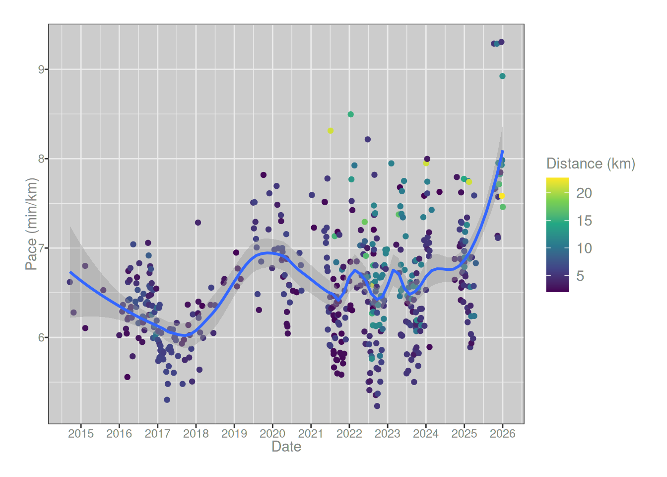
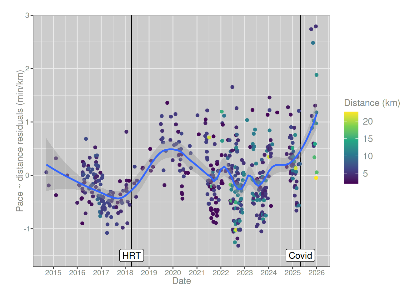
To investigate the question, the natural place to start is to draw a scatterplot showing my pace for each run as a function of the date of the run. As you can see from the loess regression line plotted in blue, there’s a very sharp spike on the right hand side, matching exactly the time at which I started running post-covid. My pace is substantially slower now than it was a year ago, and the size of the spike is much larger than any other change that I’ve experienced in the last 12 years. The only slowdown that even comes close was the one that occurred around 2018, and that one also has an explanation in terms of an exogenous factor: that was when I started taking estrogen.7
runs_summary |> ggplot2::ggplot(ggplot2::aes(date, pace)) + ggplot2::geom_point(ggplot2::aes(color = distance/1000)) + ggplot2::geom_smooth(method ="loess", formula = y ~ x, span = .3) + ggplot2::labs(x ="Date", y ="Pace (min/km)", color ="Distance (km)") + ggplot2::scale_color_viridis_c() + ggplot2::scale_x_datetime(date_breaks ="1 year", date_labels ="%Y")
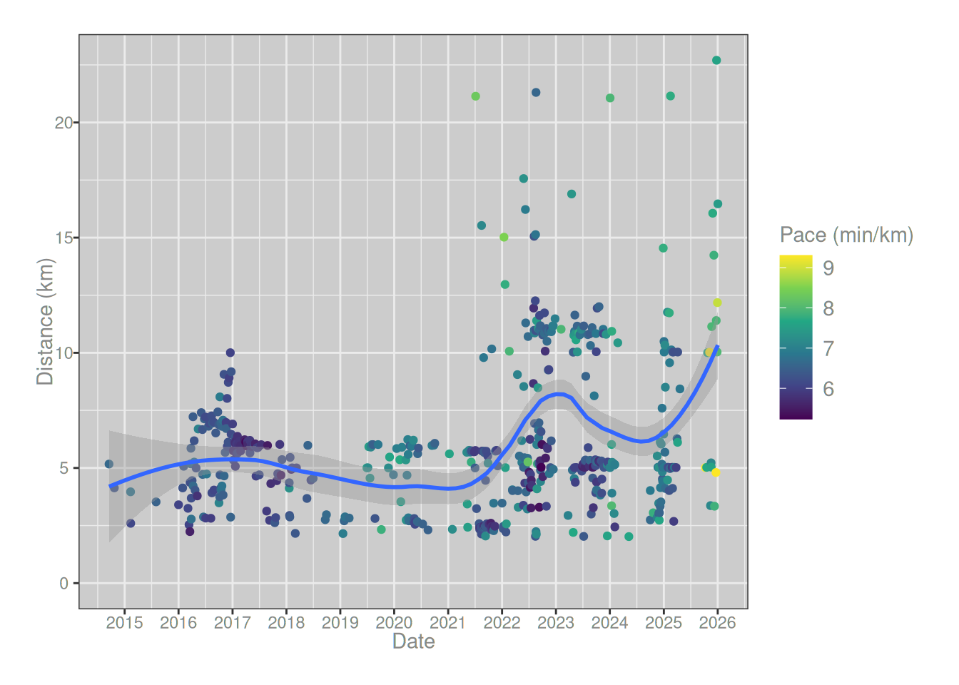
On the face of it then, there’s strong evidence for a post-covid slowing. However, the plot also gives reason for caution. The dots in the plot are coloured by the length of the run, and it’s noticeable that over time my runs have gotten longer. There are a lot more green and yellow dots from around 2022 onwards. That relationship is a little more obvious when we plot the distance of each run against the date:
runs_summary |> ggplot2::ggplot(ggplot2::aes(date, distance/1000)) + ggplot2::geom_point(ggplot2::aes(color = pace)) + ggplot2::geom_smooth(method ="loess", formula = y ~ x, span = .5) + ggplot2::labs(x ="Date", y ="Distance (km)", color ="Pace (min/km)") + ggplot2::scale_color_viridis_c() + ggplot2::scale_x_datetime(date_breaks ="1 year", date_labels ="%Y") + ggplot2::expand_limits(y =0)
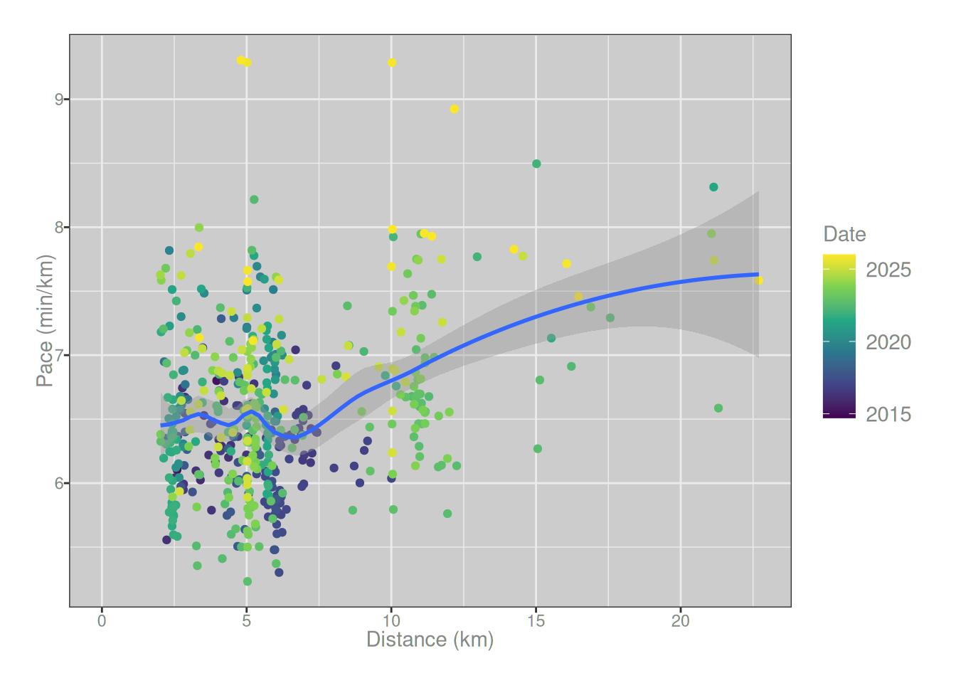
So yes, around 2022 I started doing more long runs. Not only that, I’ve tended to run slightly longer in my post-covid recovery period than I did beforehand. Not surprisingly, this is a confounding factor, because there is a relationship between the distance of a run and the pace at which it is completed:
runs_summary |> ggplot2::ggplot(ggplot2::aes(distance/1000, pace)) + ggplot2::geom_point(ggplot2::aes(color = date)) + ggplot2::geom_smooth(method ="loess", formula = y ~ x, span = .5) + ggplot2::labs(x ="Distance (km)", y ="Pace (min/km)", color ="Date") + ggplot2::scale_color_viridis_c(transform ="date") + ggplot2::expand_limits(x =0)
As a simple (and somewhat conservative) method for controlling for this relationship, I’ll adopt a hierarchical regression approach. First I’ll regress pace on distance, and then estimate a regression model to predict the residuals a function of time. Here’s what that looks like:
After controlling for the fact that my runs have gotten longer over time, the size of my post-covid performance loss is somewhat reduced, but it’s still there and it’s still larger than the effect of estrogen post-transition. Admittedly, it’s still early days. I’ve only been back to running for a couple of months. My body could very well return to normal, and this might just be a blip. And of course there’s a lot of other things going on too. Some of my medications have an impact on things like heart rate and blood pressure, and that also likely has a big impact. It’s not actually clear that the slowdown can be attributed solely to long covid, because some of my medication has changed in the last year too.
In short, while the causal explanation for all this is a little hard to pin down, it’s pretty clear I haven’t just been imagining it. There’s a real effect that shows up in the data.
Well, that’s a relief.
Footnotes
Special mention here goes to fitbit and the truly bizarre “target cardio load” calculations that are never explained, and appear to drastically overweight recent data – hon the fact that I ran a half-marathon last week absolutely does not mean you should assume I’m capable of repeating that feat this week ffs↩︎
In this blog post I’ve written my own code to do all this – for no reason other than I wanted to do it myself – but it’s worth noting that Jonathan Carroll has written the runkeepR package that may be of use to people less masochistic than I am.↩︎
Later, I ended up working there for several years. It was lovely right up to the moment I collided with institutional transmisogyny. Le sigh.↩︎
Similarly, the gpx file doesn’t specify a geodetic datum: it only gives latitute and longitude. Again, if I were less lazy I’d dig into this further, but in my brief explorations the issue has only arisen once and it was sufficient to do the usual thing and assume WGS84.↩︎
The main reason I got a key for myself is that I wanted to use the webshot2 package to take snapshots and convert maps to image files. It works, but you do need to supply the API key for that one: otherwise the final image will be missing the map tiles.↩︎
No, the .Renviron file containing the API key is not committed to that repo any more than it is committed to this one, I’m not that much of an amateur.↩︎
This post isn’t the place to talk about it, but hormones really do have a substantial effect on the athletic performance of trans folks. When I started hormones in 2018 I noticed the effect on my running almost immediately. It took a few years of incredibly stubborn work (and faaaar more training than I ever did pre-transition) to get back to the level of performance that was effortless for me before transition.↩︎