In recent weeks I’ve been posting generative art from the Water Colours series on twitter. The series has been popular, prompting requests that I sell prints, mint NFTs, or write a tutorial showing how they are made. For personal reasons I didn’t want to commercialise this series. Instead, I chose to make the pieces freely available under a CC0 public domain licence and asked people to donate to a gofundme I set up for a charitable organisation I care about (the Lou’s Place women’s refuge here in Sydney). I’m not going to discuss the personal story behind this series, but it does matter. As I’ve mentioned previously, the art I make is inherently tied to moods. It is emotional in nature. In hindsight it is easy enough to describe how the system is implemented but this perspective is misleading. Although a clean and unemotional description of the code is useful for explanatory purposes, the actual process of creating the system is deeply tied to my life, my history, and my subjective experience. Those details are inextricably bound to the system. A friend described it better than I ever could:
The computer doesn’t make this art any more than a camera makes a photograph; art is always intimate (Amy Patterson)
In this post I’ll describe the mechanistic processes involved in creating these pieces, but this is woefully inadequate as a description of the artistic process as a whole. The optical mechanics of a camera do not circumscribe the work of a skilled photographer. So it goes with generative art. The code describes the mechanics; it does not describe the art. There is a deeply personal story underneath these pieces (one that I won’t tell here), and I would no more mint an NFT from that story than I would sell a piece of my soul to a collector.
The water colours repository
Why use version control here?
When I started making generative art I didn’t think much about archiving my art or keeping it organised. I liked making pretty things, and that was as far as my thought process went. I didn’t place the code under version control, and I stored everything in my Dropbox folder. There’s nothing wrong with that: some things don’t belong on GitHub. During the development phase of any art project that’s still what I do, and I’m perfectly happy with it.
Things become a little trickier when you want to share the art. My art website is hosted on GitHub pages, and so my initial approach was to keep the art in the website repository. Huuuuge mistake. Sometimes the image files can be quite large and sometimes a series contains a large number of images. By the time I’d reached 40+ series, Hugo took a very long time to build the site (several minutes), and GitHub took even longer to deploy it (over half an hour).
Eventually I decided it made more sense to have one repository per series. Each one uses the “series-” prefix to remind me it’s an art repo. I don’t use these repositories during development: they exist solely to snapshot the release. For example, the series-water-colours repository isn’t going to be updated regularly, it’s really just an archive combined with a “docs” folder that is used to host a minimal GitHub Pages site that makes the images public. It’s convenient for my purposes because my art website doesn’t have to host any of the images: all it does is hotlink to the images that are exposed via the series repo.
It may seem surprising that I’ve used GitHub for this. Image files aren’t exactly well suited to version control, but it’s not like they’re going to be updated. Plus, there are a lot of advantages. I can explicitly include licencing information in the repository, I can release source code (when I want to), and I can include a readme file for anyone who wants to use it.
The manifest file
One nice feature of doing things this way is that it has encouraged me to include a manifest file. Because the image files belong to a completely different repository to the website, I need a way to automatically inspect the image repository and construct the links I need (because I’m waaaaaay too lazy to add the links by hand). That’s the primary function of the manifest. The manifest.csv file is a plain csv file with one row per image, and one column for each piece of metadata I want to retain about the images. It might seem like organisational overkill to be this precise about the art, but I’m starting to realise that if I don’t have a proper system in place I’ll forget minor details like “what the piece is called” or “when I made it”. That seems bad :-)
I can use readr::read_csv() to download the manifest and do a little data wrangling to organise it into a format that is handy to me right now:
More to the point, the manifest data frame is nicely suited for use with the bs4cards package, so I can display some of the pieces in a neat and tidy thumbnail grid. Here are the first eight pieces from the series, arranged by date of creation:
Each thumbnail image links to a medium resolution (2000 x 2000 pixels) jpg version of the corresponding piece, if you’d like to see the images in a little more detail.
Dependencies
In the remainder of this post I’ll walk you through the process of creating pieces “in the style of” the water colours series. If you really want to, you can take a look at the actual source, but it may not be very helpful: the code is little opaque, poorly structured, and delegates a lot of the work to the halftoner and jasmines packages, neither of which is on CRAN. To make it a little easier on you, I’ll build a new system in this post that adopts the same core ideas.
In this post I’ll assume you’re already familiar with data wrangling and visualisation with tidyverse tools. This is the subset of tidyverse packages that I have attached, and the code that follows relies on all these in some fashion:
The R environment is specified formally in the lockfile. It’s a story for another day, but for reproducibility purposes I have a separate renv configuration for every post
In addition to tidyverse and base R functions, I’ll use a few other packages as well. The magick, raster, rprojroot, fs, and ambient packages are all used in making the art. Because functions from those packages may not be as familiar to everyone, I’ll namespace the calls to them in the same way I did with bs4cards::cards() previously. Hopefully that will make it easier to see which functions belong to one of those packages.
Art from image processing
Finding the image file
As in life, the place to start is knowing where you are.
This post is part of my blog, and I’ll need to make use of an image file called "jasmine.jpg" stored alongside my R markdown. First, I can use rprojroot to find out where my blog is stored. I’ll do that by searching for a "_quarto.yml" file:
blog <- rprojroot::find_root("_quarto.yml")blog
[1] "/home/danielle/GitHub/quarto-blog"
I suspect that most people reading this would be more familiar with the here package that provides a simplified interface to rprojroot and will automatically detect the .Rproj or .here file associated with your project. In fact, because the here::here() function is so convenient, it’s usually my preferred method for solving this problem. Sometimes, however, the additional flexibility provided by rprojroot is very useful. Some of my projects are comprised of partially independent sub-projects, each with a distinct root directory. That happens sometimes when blogging: there are contexts in which you might want to consider “the blog” to be the project, but other contexts in which “the post” might be the project. If you’re not careful this can lead to chaos (e.g., RStudio projects nested inside other RStudio projects), and I’ve found rprojroot very helpful in avoiding ambiguity in these situations.
Having chosen “the blog” as the root folder, the next step in orientation is to find the post folder. Because this is a distill blog, all my posts are stored in the _posts folder, and I’ve adopted a consistent namingconvention for organising the post folders. Every name begins with the post date in year-month-day format, followed by a human-readable “slug”:
post <-paste(params$date, params$slug, sep ="_")post
[1] "2021-09-07_water-colours"
This allows me to construct the path to the image file:
file <- fs::path(blog, "posts", post, "jasmine.jpg")file
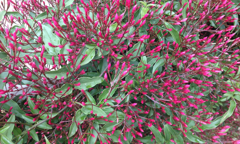
The photo has an emotional resonance to me: it dates back to 2011 and appeared on the cover of Learning Statistics with R. Although 10 years separate the Water Colours series from the text and the photo, the two are linked by a shared connection to events from a decade ago
Importing the image
Our next step is to import the image into R at a suitable resolution. The original image size is 1000x600 pixels, which is a little more than we need. Here’s a simple import_image() function that does this:
Internally, the work is being done by the fabulous magick package that provides bindings to the ImageMagick library. In truth, it’s the ImageMagick library that is doing most the work here. R doesn’t load the complete image, it lets ImageMagick take care of that. Generally that’s a good thing for performance reasons (you don’t want to load large images into memory if you can avoid it), but in this case we’re going to work with the raw image data inside R.
This brings us to the next task…
Converting the image to data
Converting the image into a data structure we can use is a two step process. First, we create a matrix that represents the image in a format similar to the image itself. That’s the job of the construct_matrix() function below. It takes the image as input, and first coerces it to a raster object and then to a regular matrix: in the code below, the matrix is named mat, and the pixel on the i-th row and j-th column of the image is represented by the contents of mat[i, j].
construct_matrix <-function(image) {# read matrix mat <- image %>%as.raster() %>%as.matrix()# use the row and column names to represent co-ordinatesrownames(mat) <-paste0("y", nrow(mat):1) # <- flip ycolnames(mat) <-paste0("x", 1:ncol(mat))return(mat)}
A little care is needed when interpreting the rows of this matrix. When we think about graphs, the values on y-axis increase as we move our eyes upwards from the bottom, so our mental model has the small numbers at the bottom and the big numbers at the top. But that’s not the only mental model in play here. When we read a matrix or a table we don’t look at it, we read it - and we read from top to bottom. A numbered list, for example, has the smallest numbers at the top, and the numbers get bigger as we read down the list. Both of those mental models are sensible, but it’s hard to switch between them.
The tricky part here is that the raw image is encoded in “reading format”. It’s supposed to be read like a table or a list, so the indices increase as we read down the image. The image data returned by construct_matrix() is organised this format. However, when we draw pictures with ggplot2 later on, we’re going to need to switch to a “graph format” convention with the small numbers at the bottom. That’s the reason why the code above flips the order of the row names. Our next task will be to convert this (reading-formatted) matrix into a tidy tibble, and those row and column names will become become our (graph-formatted) x- and y-coordinates, so the row names need to be labelled in reverse order.
To transform the image matrix into a tidy tibble, I’ve written a handy construct_tibble() function:
construct_tibble <-function(mat) {# convert to tibble tbl <- mat %>%as.data.frame() %>%rownames_to_column("y") %>%as_tibble() # reshape tbl <- tbl %>%pivot_longer(cols =starts_with("x"),names_to ="x",values_to ="shade" ) # tidy tbl <- tbl %>%arrange(x, y) %>%mutate(x = x %>%str_remove_all("x") %>%as.numeric(),y = y %>%str_remove_all("y") %>%as.numeric(),id =row_number() )return(tbl)}
The code has the following strucure:
The first part of this code coerces the matrix to a plain data frame, then uses rownames_to_columns() to extract the row names before coercing it to a tibble. This step is necessary because tibbles don’t have row names, and we need those row names: our end goal is to have a variable y to store those co-ordinate values.
The second part of the code uses pivot_longer() to capture all the other variables (currently named x1, x2, etc) and pull them down into a single column that specifies the x co-ordinate. At this stage, the tbl tibble contains three variables: an x value, a y value, and a shade that contains the hex code for a colour.
The last step is to tidy up the values. After pivot_longer() does its job, the x variable contains strings like "x1", "x2", etc, but we’d prefer them to be actual numbers like 1, 2, etc. The same is true for the y variable. To fix this, the last part of the code does a tiny bit of string manipulation using str_remove_all() to get rid of the unwanted prefixes, and then coerces the result to a number.
The names_prefix argument to pivot_longer() can transform x without the third step, but I prefer the verbose form. I find it easier to read and it treats x and y the same
Taken together, the import_image(), construct_matrix(), and construct_tibble() functions provide us with everything we need to pull the data from the image file and wrangle it into a format that ggplot2 is expecting:
jas <- file %>%import_image(width =100, height =60) %>%construct_matrix() %>%construct_tibble()jas
A little unusually, the hex codes here are specified in RGBA format: the first two alphanumeric characters specify the hexadecimal code for the red level, the second two represent the green level (or “channel”), the third two are the blue channel, and the last two are the opacity level (the alpha channel). I’m going to ignore the alpha channel for this exercise though.
There’s one last thing to point out before turning to the fun art part. Notice that jas also contains an id column (added by the third part of the construct_tibble() function). It’s generally good practice to have an id column that uniquely identifies each row, and will turn out to be useful later when we need to join this data set with other data sets that we’ll generate.
Art from data visualisation
Let the art begin!
The first step is to define a helper function ggplot_themed() that provides a template that we’ll reuse in every plot. Mostly this involves preventing ggplot2 from doing things it wants to do. When we’re doing data visualisation it’s great that ggplot2 automatically provides things like “legends”, “axes”, and “scales” to map from data to visual aesthetics, but from an artistic perspective they’re just clutter. I don’t want to manually strip that out every time I make a plot, so it makes sense to have a function that gets rid of all those things:
This “template function” allows us to start with a clean slate, and it makes our subsequent coding task easier. The x and y aesthetics are already specified, ggplot2 won’t try to “interpret” our colours and sizes for us, and it won’t mess with the aspect ratio. In a sense, this function turns off the autopilot: we’re flying this thing manually…
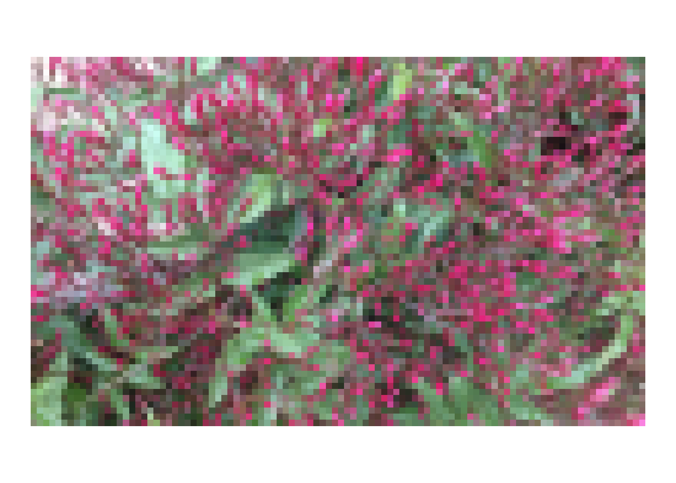
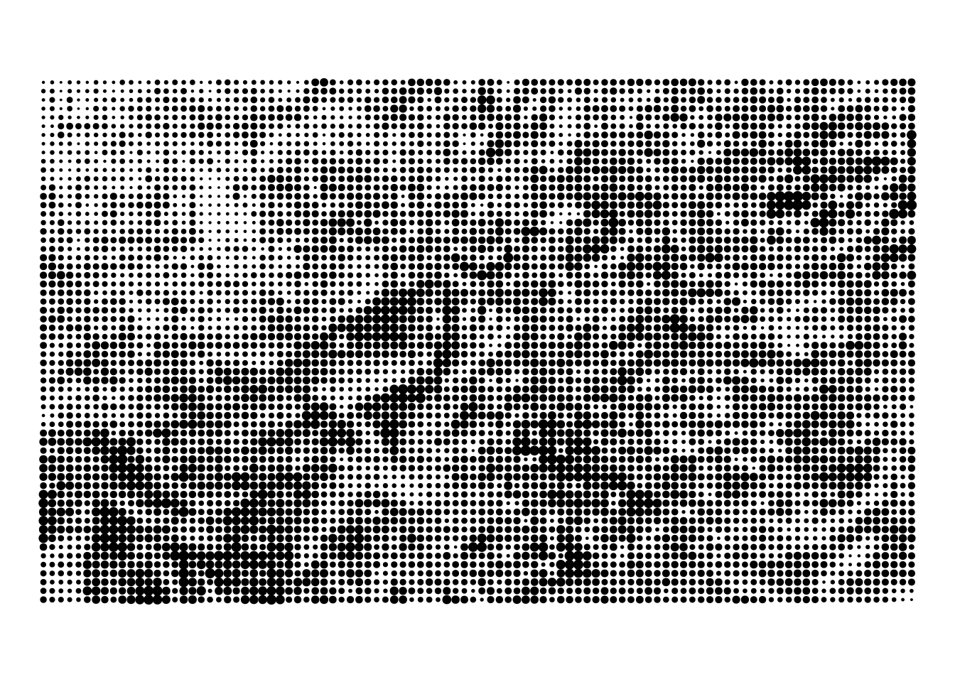
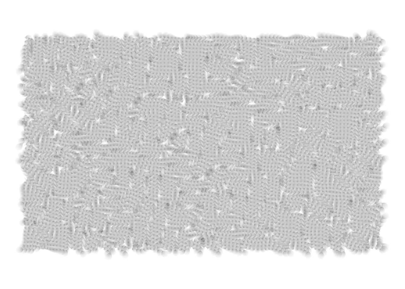
There are many ways to plot the jas data in ggplot2. The least imaginative possibility is geom_tile(), which produces a pixellated version of the jasmines photo:
jas %>%ggplot_themed() +geom_tile(aes(fill = shade))
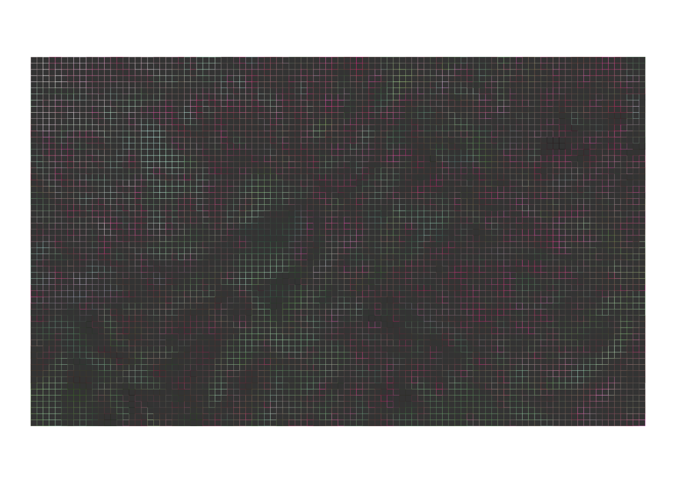
Of course, if you are like me you always forget to use the fill aesthetic. The muscle memory tells me to use the colour aesthetic, so I often end up drawing something where only the borders of the tiles are coloured:
jas %>%ggplot_themed() +geom_tile(aes(colour = shade))
It’s surprisingly pretty, and a cute demonstration of how good the visual system is at reconstructing images from low-quality input: remarkably, the jasmines are still perceptible despite the fact that most of the plot area is black. I didn’t end up pursuing this (yet!) but I think there’s a lot of artistic potential here. It might be worth playing with at a later date. In that sense generative art is a lot like any other kind of art (or, for that matter, science). It is as much about exploration and discovery as it is about technical prowess.
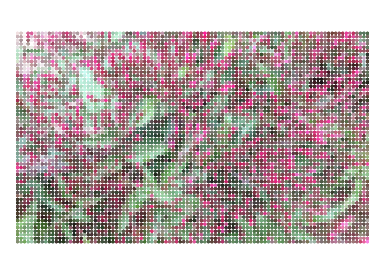
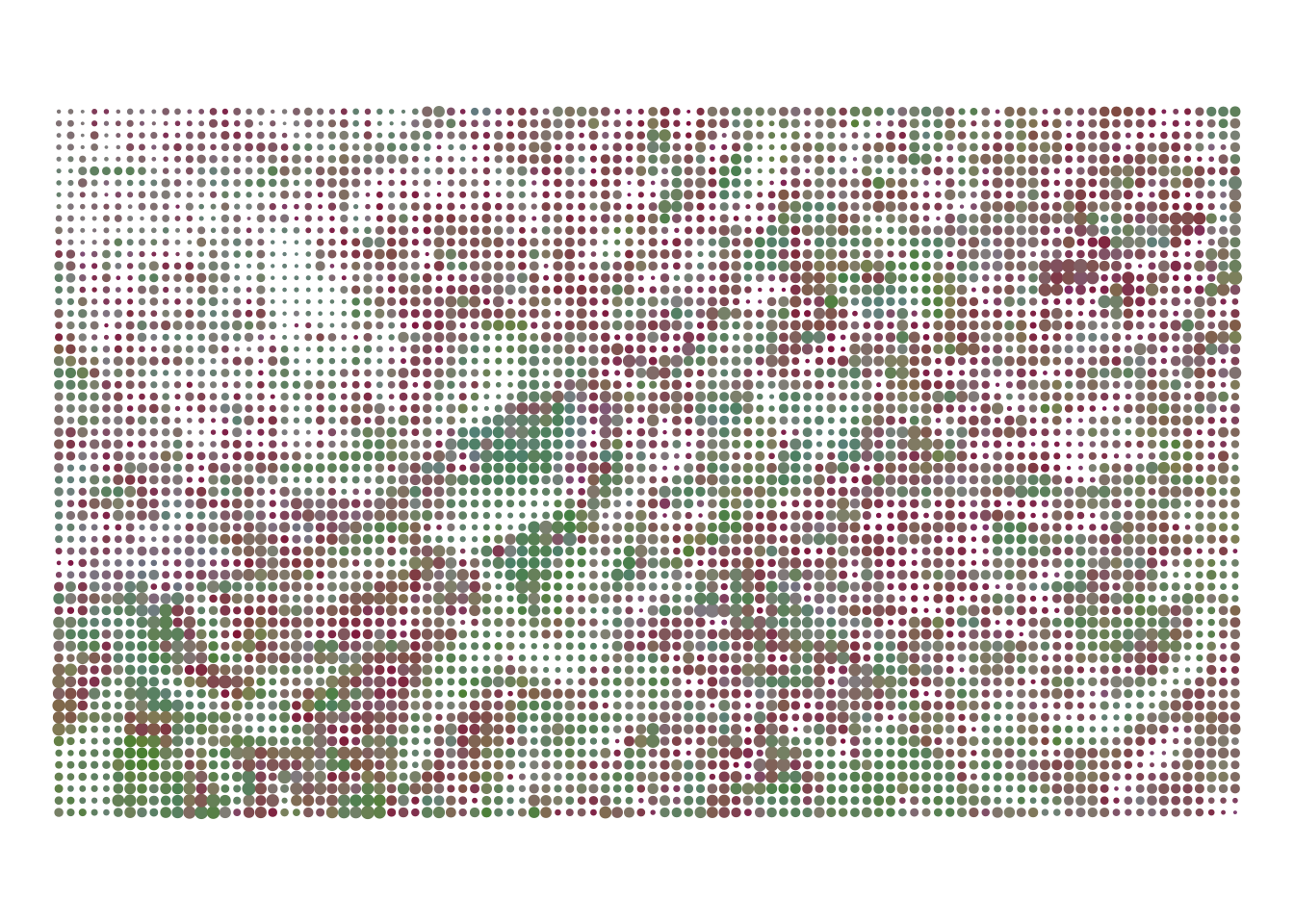
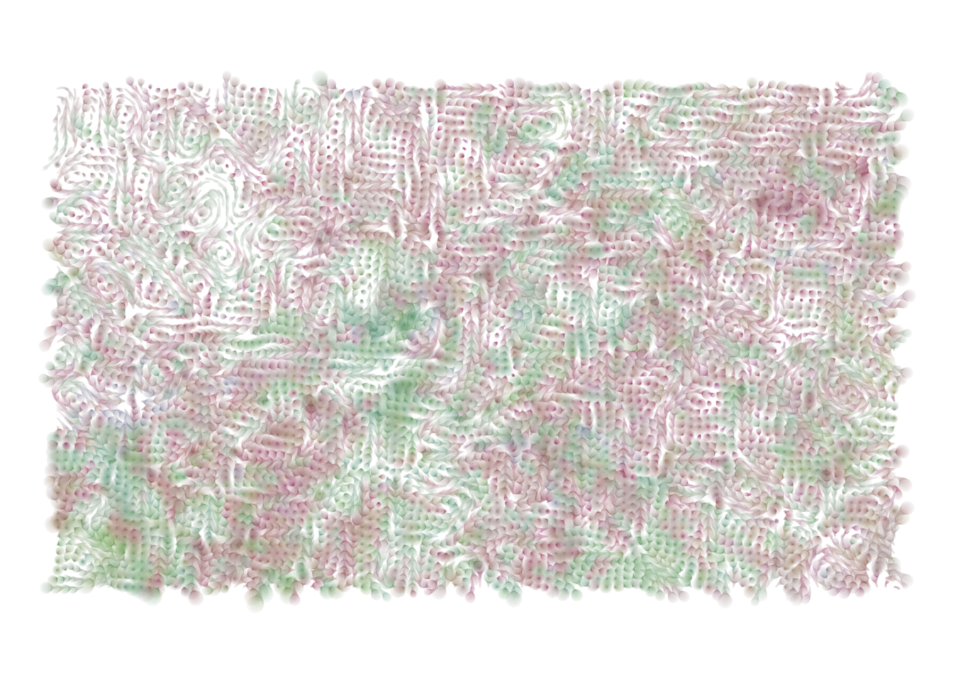
The path I did follow is based on geom_point(). Each pixel in the original image is plotted as a circular marker in the appropriate colour. Here’s the simplest version of this idea applied to the jas data:
jas %>%ggplot_themed() +geom_point(aes(colour = shade))
It’s simple, but I like it.
Extracting the colour channels
Up to this point we haven’t been manipulating the colours in any of the plots: the hex code in the shade variable is left intact. There’s no inherent reason we should limit ourselves to such boring visualisations. All we need to do is extract the different “colour channels” and start playing around.
It’s not too difficult to do this: base R provides the col2rgb() function that separates the hex code into red, green, blue channels, and represents each channel with integers between 0 and 255. It also provides the rgb2hsv() function that converts this RGB format into hue, saturation, and value format, represented as numeric values between 0 and 1.
This technique is illustrated by the extract_channels() helper function shown below. It looks at the shade column in the data frame, and adds six new columns, one for each channel. I’m a sucker for variable names that are all the same length (often unwisely), and I’ve named them red, grn, blu, hue, sat, and val:
A whole new world of artistic possibilities has just emerged!
Art from channel manipulation
One way to use this representation is in halftone images. If you have a printer that contains only black ink, you can approximate shades of grey by using the size of each dot to represent how dark that pixel should be:
In this code the ambient::normalise() function is used to rescale the input to fall within a specified range. Usually ggplot2 handles this automatically, but as I mentioned, we’ve turned off the autopilot…
For real world printers, this approach is very convenient because it allows us to construct any shade we like using only a few different colours of ink. In the halftone world shades of grey are merely blacks of different size, pinks are merely sizes of red (sort of), and so on.
But we’re not using real printers, and in any case the image above is not a very good example of a halftone format: I’m crudely mapping 1-val to the size aesthetic, and that’s not actually the right way to do this (if you want to see this done properly, look at the halftoner package). The image above is “inspired by” the halftone concept, not the real thing. I’m okay with that, and abandoning the idea of fidelity opens up new possibilities. For example, there’s nothing stopping us retaining the original hue and saturation, while using dot size to represent the intensity value. That allows us to produce “halftonesque” images like this:
In this code, the hsv() function takes the hue and saturation channels from the original image, but combines them with a constant intensity value: the output is a new colour specified as a hex code that ggplot2 can display in the output. Because we have stripped out the value channel, we can reuse the halftone trick. Much like a halftone image, the image above uses the size aesthetic to represent the intensity at the corresponding pixel.
Intermission
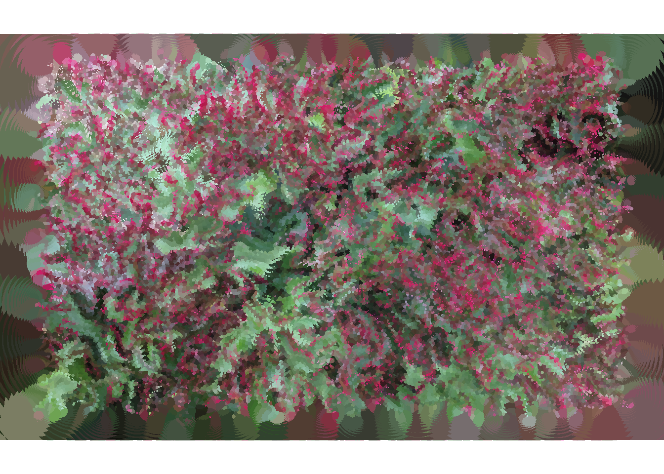
Up to this point I’ve talked about image manipulation, and I hope you can see the artistic potential created when we pair image processing tools like magick with data visualisation tools like ggplot2. What I haven’t talked about is how to choose (or generate!) the images to manipulate, and I haven’t talked about how we might introduce a probabilistic component to the process. I’m not going to say much about how to choose images. The possibilities are endless. For this post I’ve used a photo I took in my garden many years ago, but the pieces in Water Colours series have a different origin: I dripped some food colouring into a glass of water and took some photos of the dye diffusing. Small sections were cropped out of these photos and often preprocessed in some fashion by changing the hue, saturation etc. These manipulated photos were then passed into a noise generation process, and the output produced images like this:
How can we generate interesting noise patterns in R? As usual, there are many different ways you can do this, but my favourite method is to use the ambient package that provides bindings to the FastNoise C++ library. A proper description of what you can do with ambient is beyond what I can accomplish here. There are a lot of things you can do with a tool like this, and I’ve explored only a small subset of the possibilities in my art. Rather than make a long post even longer, what I’ll do is link to a lovely essay on flow fields and encourage you to play around yourself.
To give you a sense of what the possibilities are, I’ve written a field() function that uses the ambient package to generate noise. At its heart is ambient::gen_simplex(), a function that generates simplex noise (examples here), a useful form of multidimensional noise that has applications in computer graphics. In the code below, the simplex noise is then modified by a billow fractal that makes it “lumpier”: that’s the job of ambient::gen_billow() and ambient::fracture(). This is then modified one last time by the ambient::curl_noise() function to avoid some undesirable properties of the flow fields created by simplex noise.
In any case, here is the code. You’ll probably need to read through the ambient documentation to understand all the moving parts here, but for our purposes the main things to note are the arguments. The points argument takes a data frame or tibble that contains the x and y coordinates of a set of points (e.g., something like the jas data!). The frequency argument controls the overall “scale” of the noise: does it change quickly or slowly as you move across the image? The octaves argument controls the amount of fractal-ness (hush, I know that’s not a word) in the image. How many times do you apply the underlying transformation?
Interpreting the output of the field() function requires a little care. The result isn’t a new set of points. Rather, it is a collection of directional vectors that tell you “how fast” the x- and y-components are flowing at each of the locations specified in the points input. If we want to compute a new set of points (which is usually true), we need something like the shift() function below. It takes a set of points as input, computes the directional vectors at each of the locations, and then moves each point by a specified amount, using the flow vectors to work out how far to move and what direction to move. The result is a new data frame with the same columns and the same number of rows:
shift <-function(points, amount, ...) { vectors <-field(points, ...) points <- points %>%mutate(x = x + vectors$x * amount,y = y + vectors$y * amount,time = time +1,id = id )return(points)}
It’s worth noting that the shift() function assumes that points contains an id column as well as the x and y columns. This will be crucial later when we want to merge the output with the jas data. Because the positions of each point are changing, the id column will be the method we use to join the two data sets. It’s also worth noting that shift() keeps track of time for you. It assumes that the input data contains a time column, and the output data contains the same column with every value incremented by one. In other words, it keeps the id constant so we know which point is referred to by the row, but modifies its position in time and space (x and y). Neat.
Art from the noise
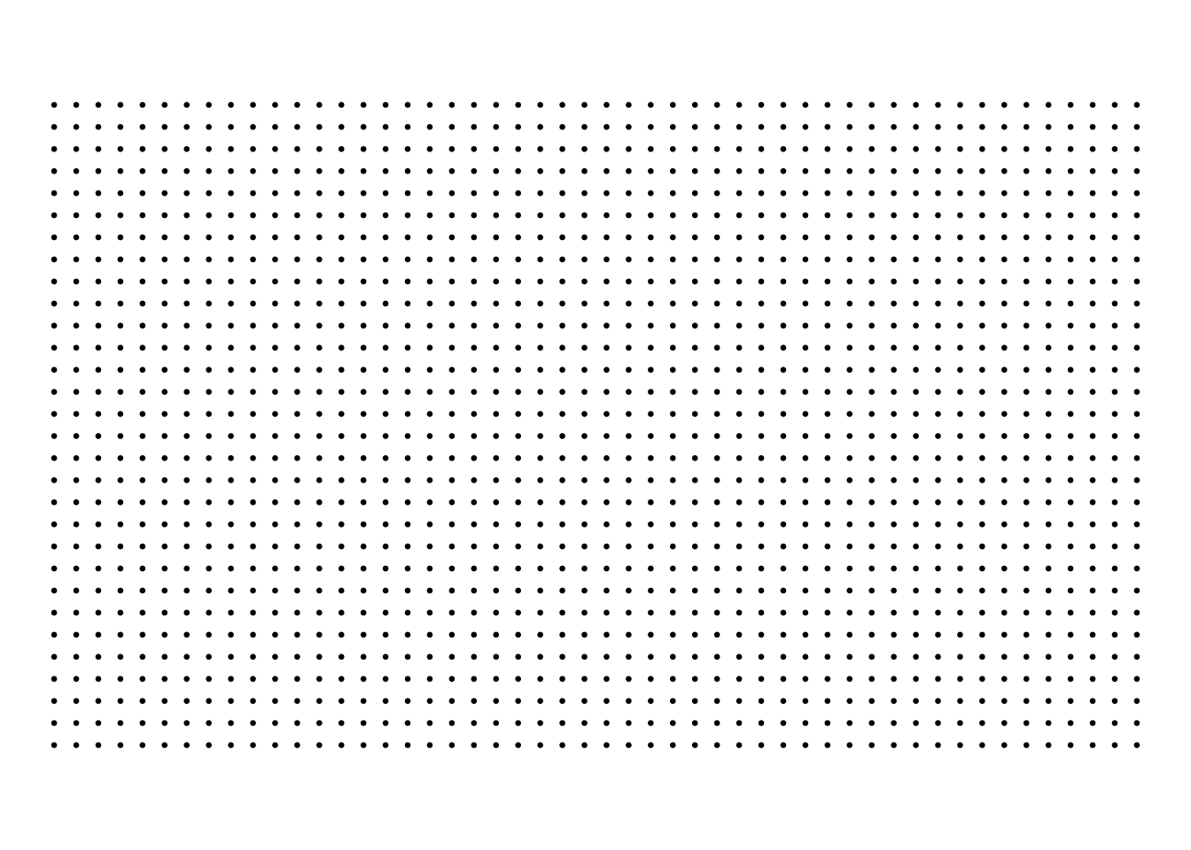
To illustrate how this all works, I’ll start by creating a regular 50x30 grid of points:
points_time0 <-expand_grid(x =1:50, y =1:30) %>%mutate(time =0, id =row_number())ggplot_themed(points_time0) +geom_point(size = .5)
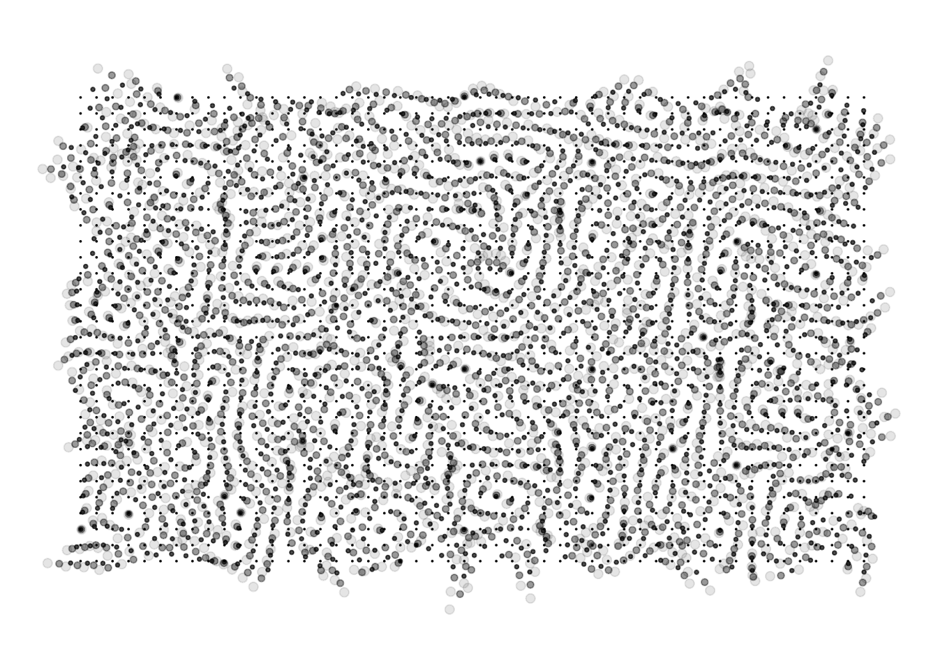
Next, I’ll apply the shift() function three times in succession, and bind the results into a single tibble that contains the the data at each point in time:
Then I’ll quickly write a couple of boring wrapper functions that will control how the size and transparency of the markers changes as a function of time…
map_size <-function(x) { ambient::normalise(x, to =c(0, 2))}map_alpha <-function(x) { ambient::normalise(-x, to =c(0, .5))}
… but also so ugly. The code I used above is awfully inelegant: I’ve “iteratively” created a sequence of data frames by writing the same line of code several times. That’s almost never the right answer, especially when the code doesn’t know in advance how many times we want to shift() the points! To fix this I could write a loop (and contrary to folklore, there’s nothing wrong with loops in R so long as you’re careful to avoid unnecessary copying). However, I’ve become addicted to functional programming tools in the purrr package, so I’m going to use those rather than write a loop.
To solve my problem I’m going to use the purrr::accumulate() function, which I personally feel is an underappreciated gem in the functional programming toolkit. It does precisely the thing we want to do here: it takes one object (e.g., points) as input together with a second quantity (e.g., an amount), and uses the user-supplied function (e.g., shift()) to produce a new object that can, once again, be passed to the user-supplied function (yielding new points). It continues with this process, taking the output of the last iteration of shift() and using it as input to the next iteration, until it runs out of amount values. It is very similar to the better-known purrr::reduce() function, except that it doesn’t throw away the intermediate values. The reduce() function is only interested in the destination; accumulate() is a whole journey.
So let’s use it. The iterate() function below gives a convenient interface:
Here’s the code to recreate the pts data from the previous section:
pts <- points_time0 %>%iterate(time =3, step =1)
It produces the same image, but the code is nicer!
Assembling the parts
Adding noise to jasmines coordinates
The time has come to start assembling the pieces of the jigsaw puzzle, by applying the flow fields from the previous section to the data associated with the jasmines image. The first step in doing so is to write a small extract_points() function that will take a data frame (like jas) as input, extract the positional information (x and y) and the identifier column (id), and add a time column so that we can modify positions over time:
extract_points <-function(data) { data %>%select(x, y, id) %>%mutate(time =0)}
Here’s how we can use this. The code below extracts the positional information from jas and then use the iterate() function to iteratively shift those positions along the paths traced out by a flow field:
pts <- jas %>%extract_points() %>%iterate(time =20, step = .1)
The pts tibble doesn’t contain any of the colour information from jas, but it does have the “right kind” of positional information. It’s also rather pretty in its own right:
We can now take the pixels from the jasmines image and make them “flow” across the image. To do this, we’ll need to reintroduce the colour information. We can do this using full_join() from the dplyr package. I’ve written a small convenience function restore_points() that performs the join only after removing the original x and y coordinates from the jas data. The reason for this is that the pts data now contains the positional information we need, so we want the x and y values from that data set. That’s easy enough: we drop those coordinates with select() and then join the two tables using only the id column. See? I promised it would be useful!
restore_points <-function(jas, pts) { jas %>%select(-x, -y) %>%full_join(pts, by ="id") %>%arrange(time, id) }
When colouring the image, we’re using the same “halftonesque” trick from earlier. The colours vary only in hue and saturation. The intensity values are mapped to the size aesthetic, much like we did earlier, but this time around the size aesthetic is a function of two variables: it depends on time as well as val. The way I’ve set it up here is to have the points get larger as time increases, but there’s no reason we have to do it that way. There are endless ways in which you could combine the positional, temporal, and shading data to create interesting generative art. This is only one example.
The last chapter
At last we have the tools we need to create images in a style similar (though not identical) to those produced by the Water Colours system. We can import, reorganise, and separate the data:
jas <- file %>%import_image(width =200, height =120) %>%construct_matrix() %>%construct_tibble() %>%extract_channels()
We can define flow fields with different properties, move the pixels through the fields, and rejoin the modified positions with the colour information
pts <- jas %>%extract_points() %>%iterate(time =40, step = .2, octaves =10, frequency = .05 )jas <- jas %>%restore_points(pts)jas
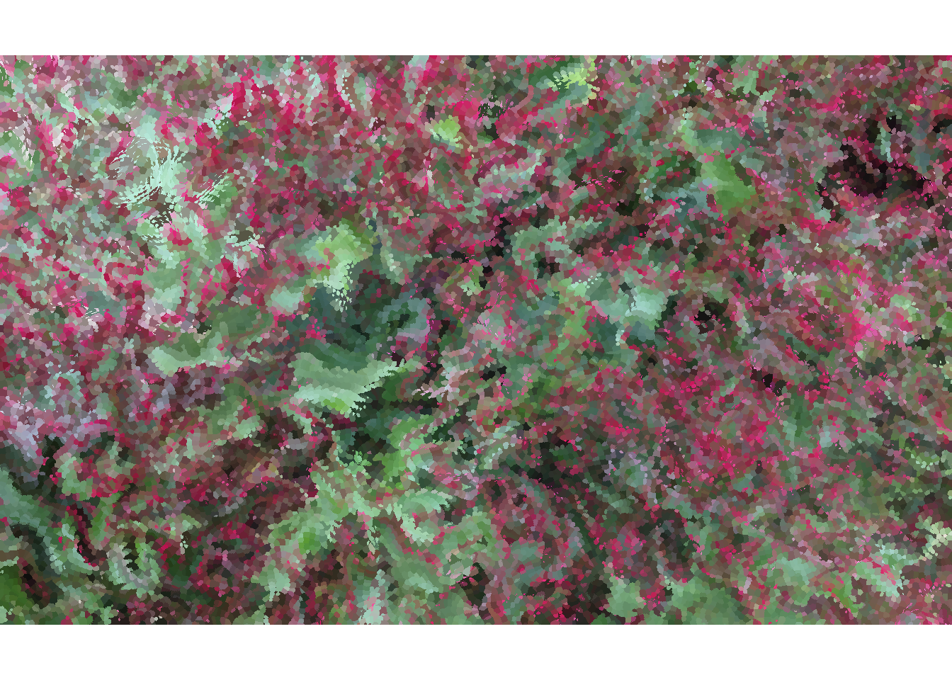
The colour bleeding over the edges here is to be expected. Some of the points created with geom_point() are quite large, and they extend some distance beyond the boundaries of the original jasmines photograph. The result doesn’t appeal to my artistic sensibilities, so I’ll adjust the scale limits in ggplot2 so that we don’t get that strange border:
The end result is something that has a qualitative similarity to the Water Colours pieces, but is also possessed of a style that is very much its own. This is as it should be. It may be true that “all art is theft” – as Picasso is often misquoted as saying – but a good artistic theft is no mere replication. It can also be growth, change, and reconstruction.
A happy ending after all.
Epilogue
I find it so amazing when people tell me that electronic music has no soul. You can’t blame the computer. If there’s no soul in the music, it’s because nobody put it there (Björk, via Tim de Sousa)
@online{navarro2021,
  author = {Navarro, Danielle},
  title = {Art, Jasmines, and the Water Colours},
  date = {2021-09-07},
  url = {https://blog.djnavarro.net/water-colours},
  langid = {en}
}